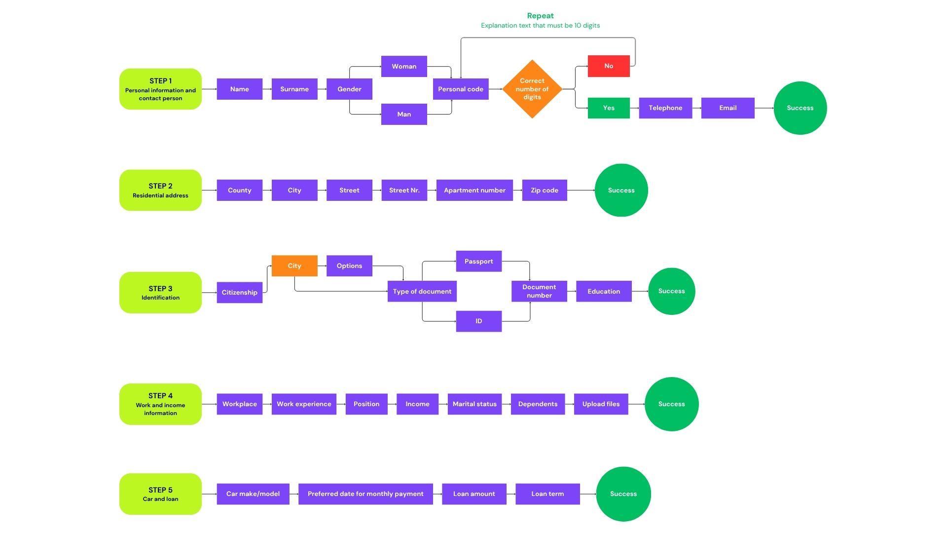
I designed the leasing journey as a single-page, step-by-step flow. You move through small steps, see a clear progress bar, and stay on the same page the whole time—no page reloads, no losing your place. If something goes wrong (like a file upload or a submit error), the form keeps your data, shows a short tip to fix it, and you can go back or forward easily inside the stepper. This keeps the process light on mobile, reduces mistakes with instant inline checks, and helps people finish without stress.

Car sales & leasing
Project Summary
Key Features
Smart catalog & guided search
Filter by type/use case, sort results, and quickly compare listings with clear specs and pricing.
Leasing made simple
Visual sliders for term and monthly payment, clear notes, and a quick path to the full leasing form.
Bank financing & rights checker
A streamlined form to check loan options plus a plain-language section about buyer rights.
Guided “Help me choose”
If you’re unsure what to buy, answer a few premade questions and get tailored car recommendations.
Description
Latvian Car Salon is a modern car sales and leasing platform created to make choosing, financing, and ordering a vehicle in Latvia as simple as possible. The website combines a clean catalog, intuitive leasing flows, and interactive tools that guide users to the right car—even if they are unsure where to start. From reserving or test-driving a vehicle to exploring financing options or submitting a custom request, every action is designed to be fast, transparent, and user-friendly. Built on more than 20 years of market experience, the platform reflects trust, professionalism, and the brand’s dedication to delivering an effortless customer journey
Defining the brand
Brand essence
Effortless, trustworthy used-car buying—guidance at every step.
Positioning statement
For drivers in Latvia who want certainty and speed when buying a used car, LATVIJAS AUTO SALONS (Latvian Car Salon) is the full-service partner that guides you from search to handover with verified cars, simple financing, and human support. This builds on the company’s long-standing reputation for professionalism and customer care.
Step 1 - Exploring the visual identity
Color palette
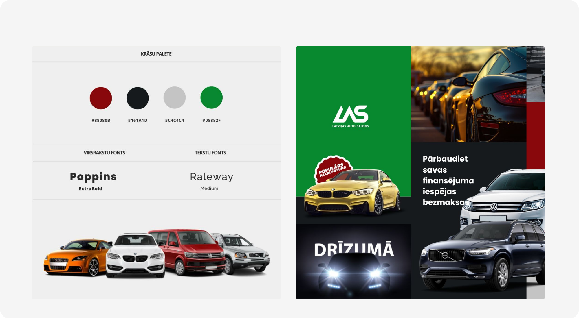
I established a high-contrast palette that balances brand impact and UI clarity: Deep Red (#88080B) for brand and primary actions, Carbon (#161A1D) for headings and key UI, Soft Gray (#C4C4C4) for backgrounds/dividers, and Approval Green (#08882F) for success/finance states. The aim is instant recognition plus clear, trustworthy interactions, aligned with the client’s emphasis on aesthetic clarity and intuitive navigation.
#88080B
#161A1D
#C4C4C4
#08882F
Typography
I paired Poppins and Raleway to balance authority with approachability. Poppins ExtraBold has a clean, geometric structure and wide counters that make big headlines and price callouts punchy and unmistakable—perfect for banners, cards, and conversion CTAs. Raleway Medium brings a lighter, airy rhythm for specs, descriptions, and form labels; its open shapes and generous spacing keep dense details (mileage, features, legal notes) readable on both mobile and desktop. Together, they create a clear hierarchy—bold guidance up top, calm clarity in the details—supporting the project’s focus on simple, trustworthy decision-making. This aligns with the client emphasis on aesthetic clarity and intuitive navigation.
Poppins (Extra Bold)
Aa Bb Cc Dd Ee Ff Gg Hh Ii Jj Kk Ll Mm Nn Oo Pp Qq Rr Ss Tt Uu Vv Ww Xx Yy Zz
Raleway (Medium)
Aa Bb Cc Dd Ee Ff Gg Hh Ii Jj Kk Ll Mm Nn Oo Pp Qq Rr Ss Tt Uu Vv Ww Xx Yy Zz
Design elements
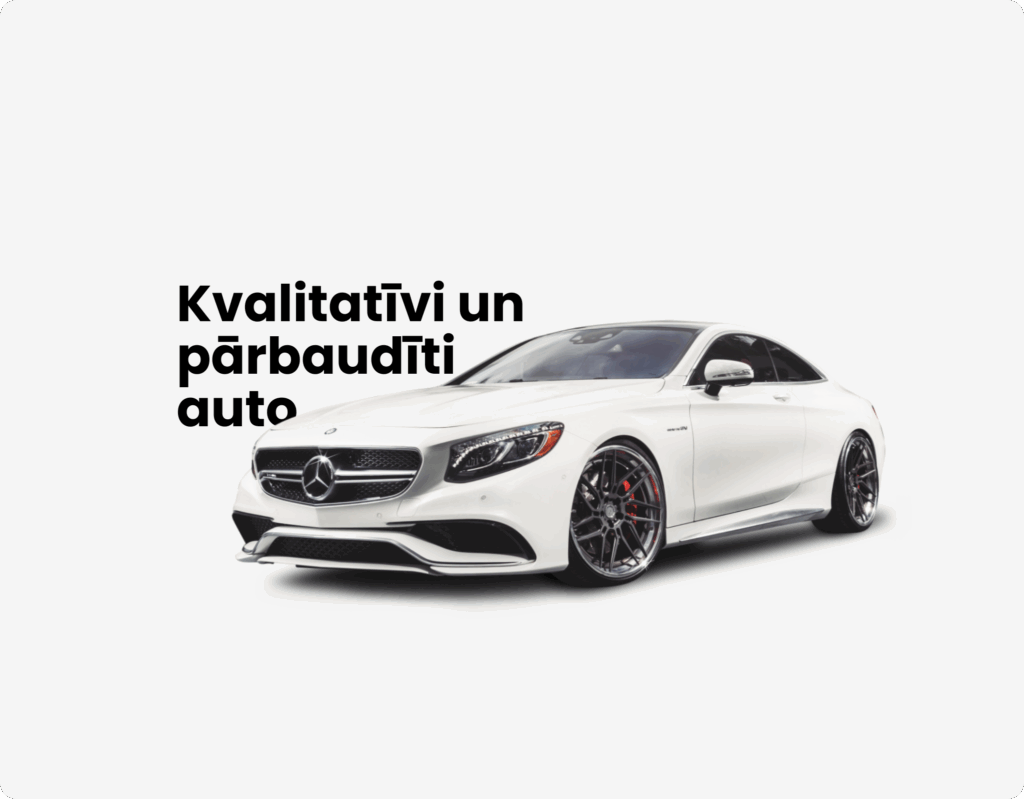
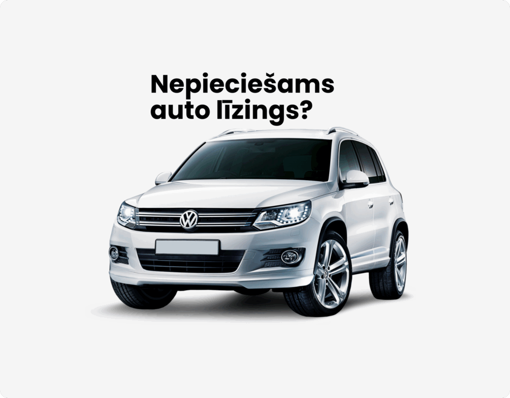
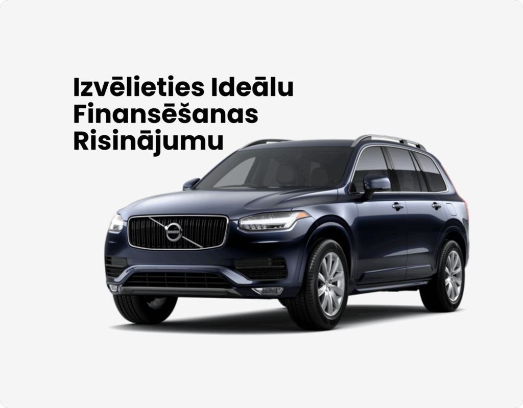
The visual system combines brand-color hero panels, PNG car cut-outs, and bold Latvian headlines to deliver a retail-clear, product-first feel. A 12-column grid and generous spacing keep pages scannable, while card components (image, price, key specs, quick actions) standardize how vehicles are presented across views. Status badges (e.g., Akcija/Atlaide, Rezervēts), wishlist icons, and comparison-friendly metadata support fast decisions. Conversion is driven by primary CTAs (Deep Red) with consistent hover/disabled states, plus secondary text links for alternatives. For financing, interactive sliders surface monthly totals in real time, paired with short forms and clear error/success patterns. A set of service tiles (delivery, test-drive, sell/trade-in) and promo modules (countdown/special offer) bring attention to high-value actions without clutter. Throughout, authentic photography is balanced with clean cut-outs to show both lifestyle and precise product detail, and microcopy stays direct and supportive to reflect the brand’s guidance-first tone. This toolkit scales across the catalog, leasing flow, and services—keeping the experience consistent, trustworthy, and conversion-oriented.
Moodboard
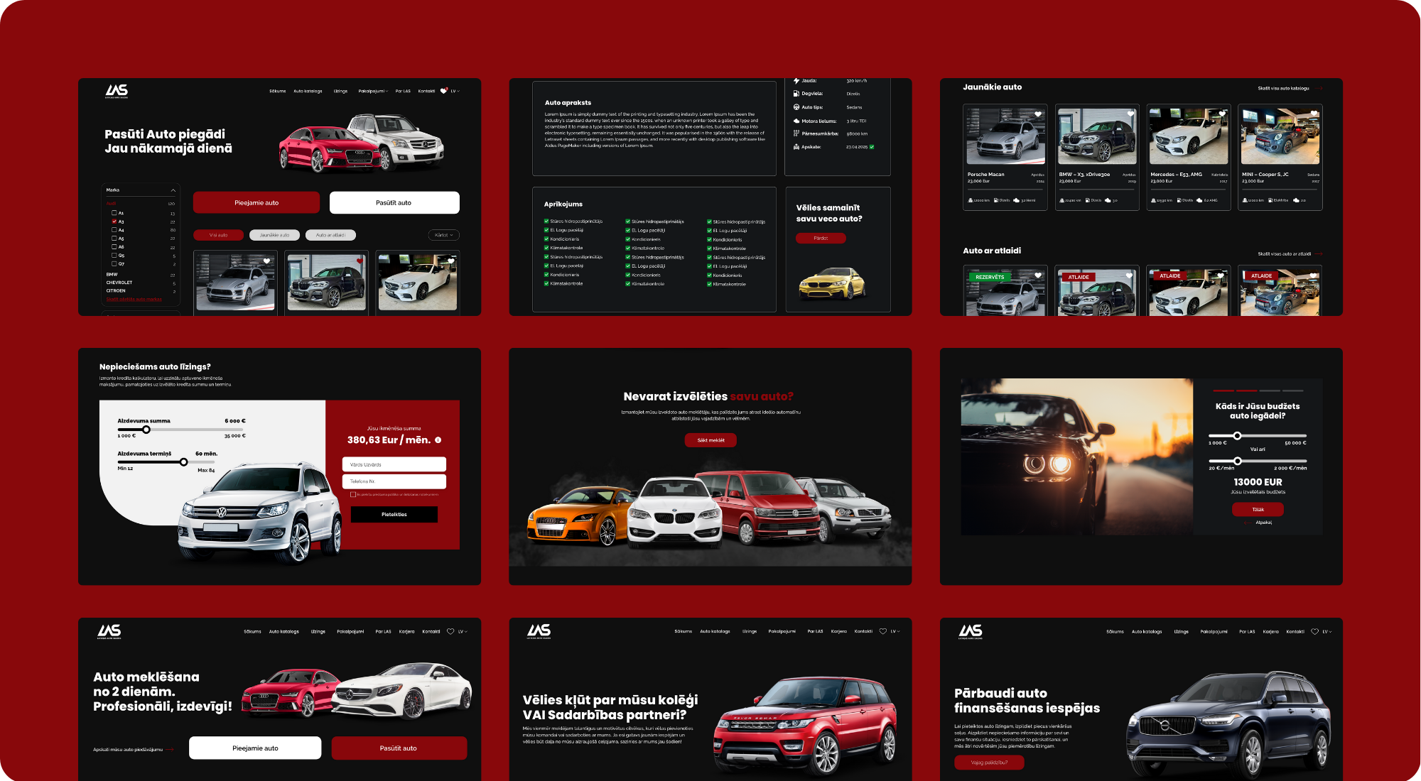
The visual system combines brand-color hero panels, PNG car cut-outs, and bold Latvian headlines to delaI built the moodboard from the client’s own materials (brand lines, service list, and example imagery) so exploration started with real content—not abstract placeholders. The board tests how bold campaign headlines, PNG car cut-outs, and authentic photography sit together in one frame, with a focus on hierarchy: message → vehicle → action. I used it to validate headline scale versus car imagery, the placement and weight of primary CTAs, how many badges or urgency cues a card can carry without clutter, and the overall reading rhythm across hero tiles and product cards. It also stress-tests contrast, spacing, and component density to ensure the look remains conversion-oriented before moving into page design.iver a retail-clear, product-first feel. A 12-column grid and generous spacing keep pages scannable, while card components (image, price, key specs, quick actions) standardize how vehicles are presented across views. Status badges (e.g., Akcija/Atlaide, Rezervēts), wishlist icons, and comparison-friendly metadata support fast decisions. Conversion is driven by primary CTAs (Deep Red) with consistent hover/disabled states, plus secondary text links for alternatives. For financing, interactive sliders surface monthly totals in real time, paired with short forms and clear error/success patterns. A set of service tiles (delivery, test-drive, sell/trade-in) and promo modules (countdown/special offer) bring attention to high-value actions without clutter. Throughout, authentic photography is balanced with clean cut-outs to show both lifestyle and precise product detail, and microcopy stays direct and supportive to reflect the brand’s guidance-first tone. This toolkit scales across the catalog, leasing flow, and services—keeping the experience consistent, trustworthy, and conversion-oriented.
Step 2 - Designing the web
Defining the user flow
I translated the brand into a clean, conversion-first interface: clear vehicle cards with price/spec priority, bold primary actions (reserve, test-drive, leasing), and focused service modules (delivery, trade-in, custom order). The catalog uses simple filters and sorting for quick comparison, while the leasing widget features sliders and live totals to make choices feel immediate. Consistent typography, spacing, and contrast maintain readability across desktop and mobile, ensuring the experience feels trustworthy, fast, and aligned with the client’s goals.