Online service for professionals
Project Summary
Client
Edgars Aivars is a Latvian influencer with 159K+ TikTok followers and over 2.4M likes. He founded Prohelp after struggling to find professionals for his house construction project.
Solution
The platform introduces a two-sided, user-friendly web interface with tailored dashboards:
Professionals can manage their services, pricing, availability, and receive inquiries through their dashboard.
Regular users can easily search for providers based on category, price, or location and track communication through their own dashboard.
This design streamlines the connection process, improves transparency, and simplifies the experience—putting all local services in one trusted place.
Description
This project is an online platform designed to connect local professionals—such as handymen, hairdressers, plumbers, and gardeners—with everyday users seeking services. On the platform, professionals can create detailed profiles showcasing their services and pricing, while regular users can freely browse listings, compare options, and message providers directly.
The platform generates revenue through monthly subscriptions from professionals. Users can access the service for free, and payments for completed jobs are handled directly between the user and the professional—outside the platform.
Problem
Many skilled professionals struggle to gain online visibility and manage job requests efficiently. Although word-of-mouth remains a strong marketing tool, many still rely on various online platforms to attract new clients. However, professionals often find themselves forced to post their service offers across multiple websites and directories just to stay visible—making it time-consuming and inefficient.
At the same time, users often find it difficult to locate trustworthy local service providers without having to sift through scattered websites and listings.
This issue became especially clear when a famous Latvian influencer tried to find workers to build his house. He faced frustration and delays, checking multiple platforms just to find reliable help. This real-life struggle highlighted the gap in the market—and sparked the vision to develop a centralized, easy-to-use platform for everyone.
Step 1 - Research
Competitor and Platform Research
I started by looking at other websites that help people find local professionals. I checked how they are built, how easy they are to use, and what kind of features they offer. This gave me a good idea of what works well and what could be improved.
Tested several platforms from both sides — like a regular user and a professional. I looked at:
How fast I can find someone and contact them
How easy it is for a professional to sign up and create a profile
What the steps are to get started
What felt confusing or slow
Made a list of features found on other platforms — like filters, messaging, price info, profiles, and reviews. Then I grouped them into:
Must-have features
Nice-to-have extras
Future ideas
To better understand how people use these kinds of platforms, I walked through the full experience — from landing on the homepage to signing up, searching for help, and contacting someone. I also looked at how the design makes people feel: is it easy to read, does it feel safe, are the reviews and profiles clear? I took all my notes and grouped them into what users want, what issues they run into, and what features actually help. This gave me a clear direction to build something that feels simple, trustworthy, and easy to use for both regular users and professionals.
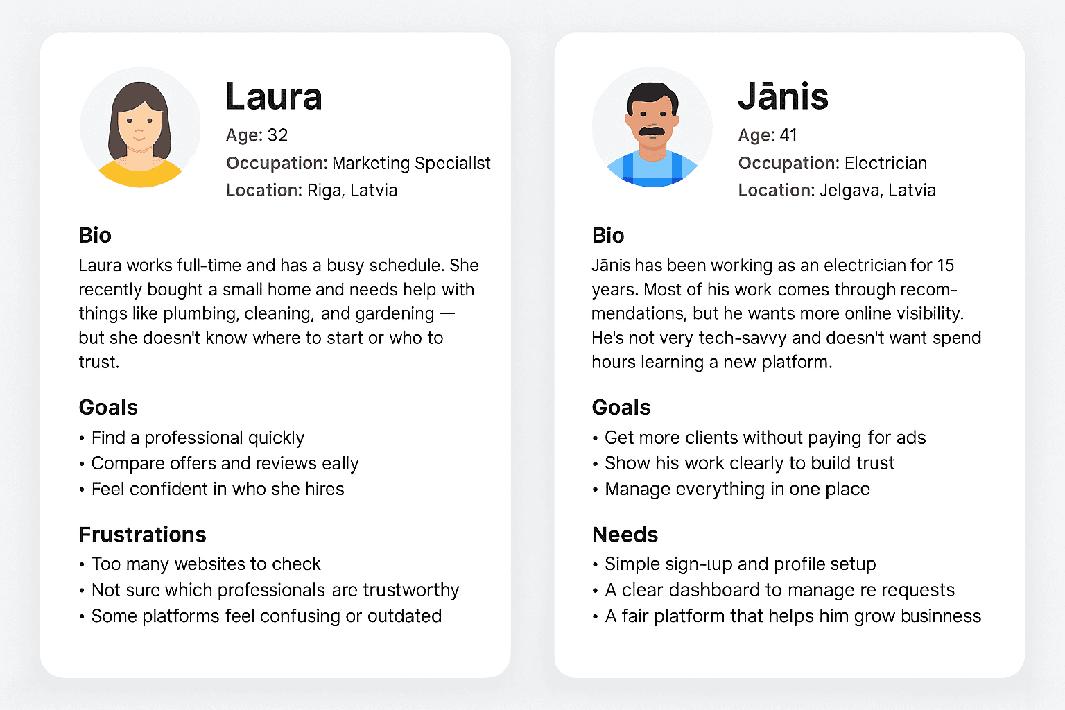
Personas
To better understand the two sides of the platform, I created personas for both key user groups: a regular user searching for help and a professional offering services. These personas helped guide my decisions when designing the experience, features, and flows.
Step 2 — UX Planning & Structure
With clear personas in place, I mapped the platform’s backbone: how information is organized and how each audience (regular users and professionals) moves through it. Because Prohelp Serviss is a two-sided platform with tailored dashboards—searching and messaging for users; service, pricing, and availability management for professionals—the focus was to reduce friction in the “find → evaluate → contact” loop while aligning the flow to the subscription business model for pros. The result is a structure that keeps browsing and filtering fast for users and makes onboarding + lead management effortless for professionals.
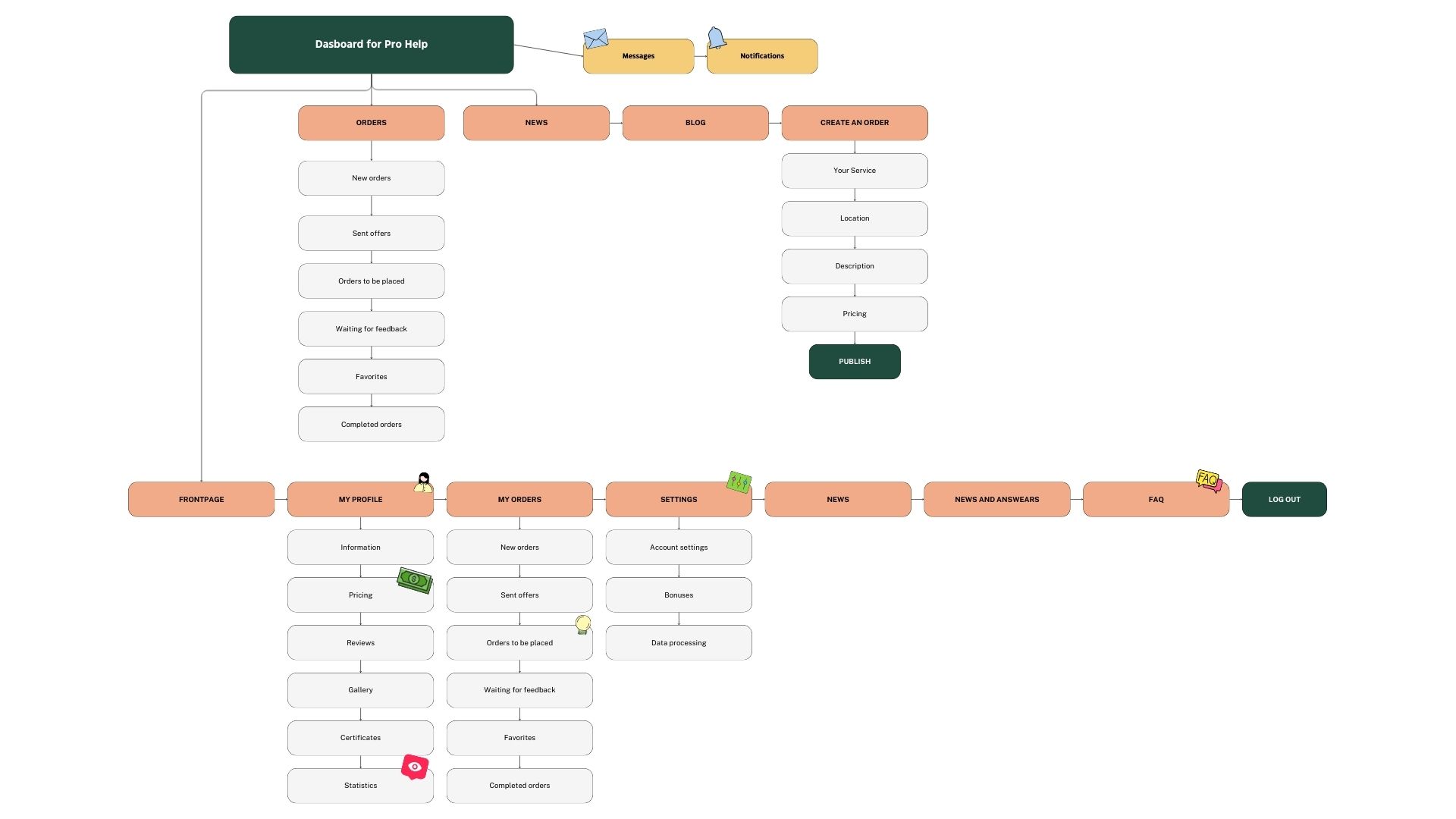
Site map
To make the platform structure clear from the beginning, I created a site map that visualized how different sections connect and how users would navigate between them. This step was important to translate project goals into a logical information architecture, reduce complexity, and align the flow with user needs.
By mapping everything out at this stage, I could focus on user priorities and business requirements simultaneously, creating a structure that supports smooth user journeys and future scalability.
Site map for profesionals
User flow
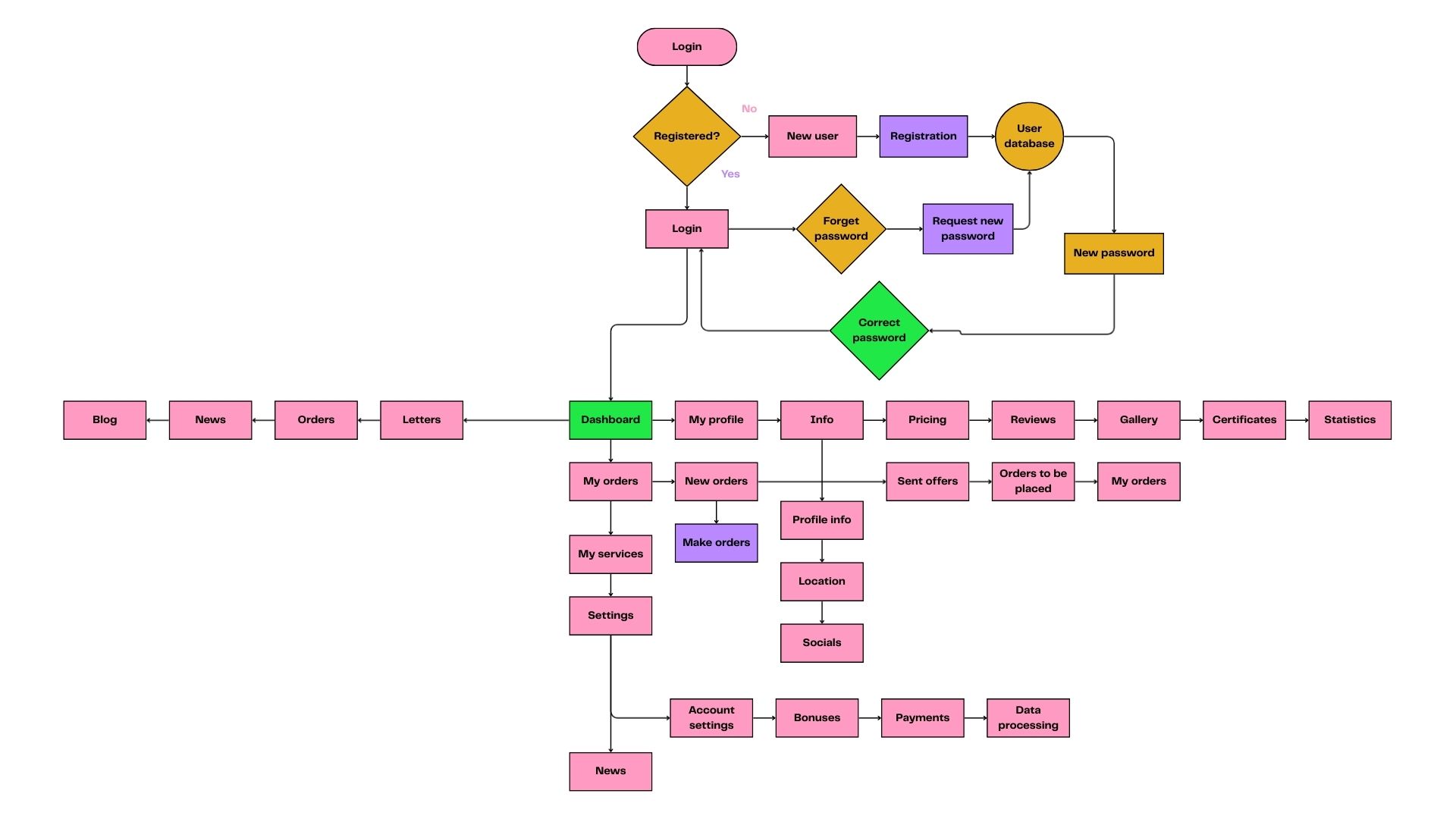
When planning the user flows for Prohelp Serviss, my main goal was to make the experience fast, simple, and with as few clicks as possible. Since the platform contains many features for both users and professionals, I focused on reducing complexity and guiding people directly to what matters. Every step was designed to feel intuitive: actions like finding a service, creating a profile, or managing requests had to be quick, accessible, and free of unnecessary steps. By streamlining the flows, the website and dashboard became easy to navigate and efficient to use, ensuring that both audiences can reach their goals without friction.
Step 3 — Design Mockup
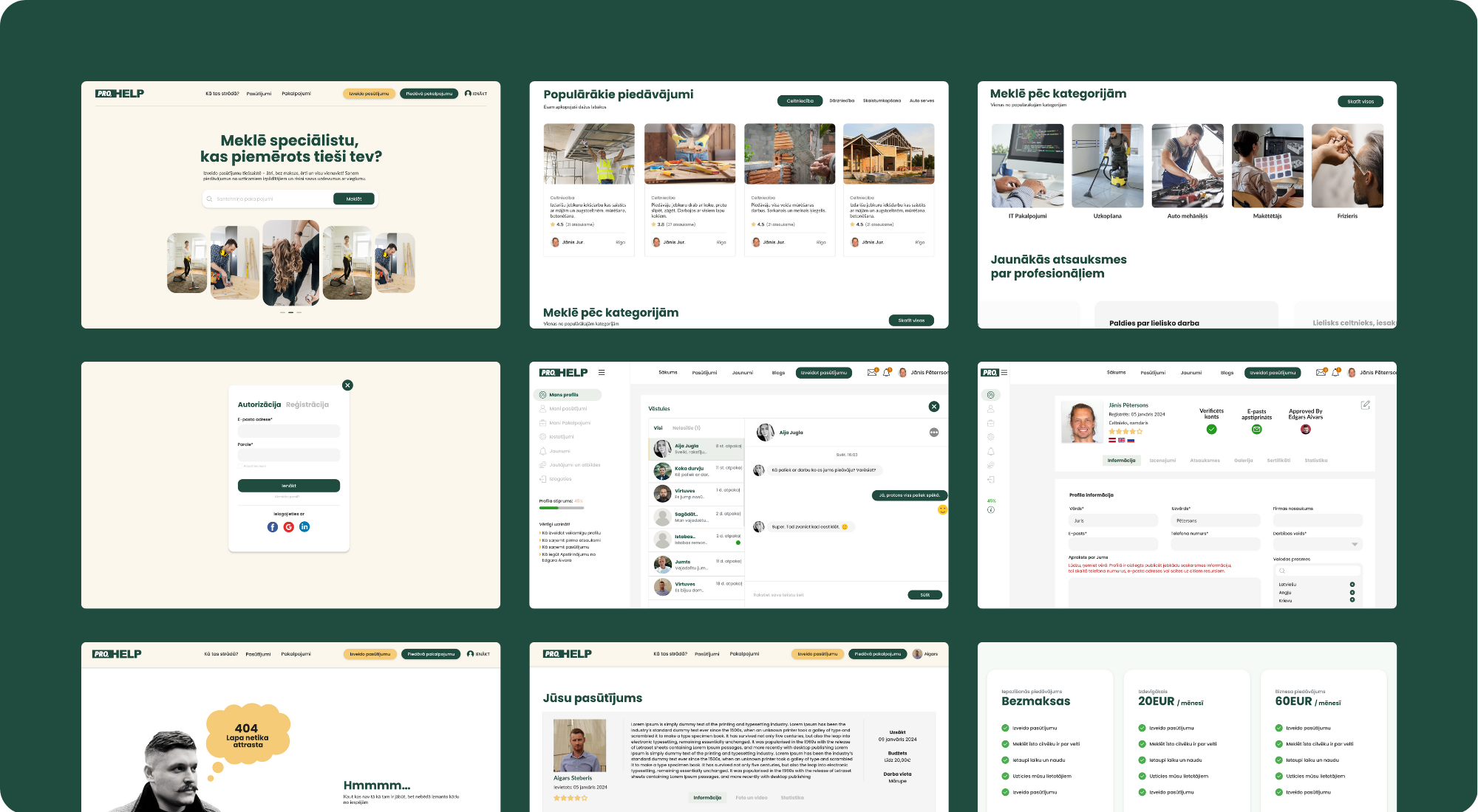
At the client’s request, I moved straight into high-fidelity mockups in Adobe XD and kept all feedback in a single cloud link. The screens are built for speed and low click-count: the profile workspace uses a top tab bar (Information, Reviews, Gallery, Certificates, Statistics) so professionals can jump between sections without losing context, while a compact verification strip keeps progress visible. Forms are grouped by task and end with one clear Publish action, reducing scattered decisions. Service areas are set visually with a map and radius slider (e.g., Riga), which cuts typing and makes coverage obvious at a glance.
Credential management happens in a focused Certificates — Add modal with preview and confirm, returning the user to the same spot instead of sending them to a separate page. Reviews open with an overall score and bar breakdown, followed by individual comments and a straightforward reply option—fast for visitors to scan, simple for professionals to manage. Throughout, a consistent grid (see guides), large tap targets, and AA contrast keep the UI clear on desktop and mobile. Primary actions sit in predictable places and the footer remains stable across states, making the interface feel steady, efficient, and handoff-ready.
Conclusion
Prohelp Serviss is more than just a platform—it’s a bridge between need and capability. By designing a two-sided system that addresses both professionals’ and users’ needs, the project delivers real value:
For professionals, it offers a streamlined, centralized way to present services, manage pricing, availability, and inquiries.
For users, it provides clarity, transparency, and ease in discovering trusted local help.
Throughout the project, I balanced user empathy, business logic, and usability. I focused on minimizing friction in key flows (finding → evaluating → contacting) and structured the dashboards so each user type can act with confidence and efficiency.
In building this, I learned:
How important clear role separation and tailored flows are for two-sided platforms
The value of progressive design (grouping tasks, minimizing clutter, keeping click counts low)
That trust signals (reviews, credentials, clarity in profiles) aren’t just extras—they’re essential
And finally, that an MVP approach (launch with core features, refine with feedback) leads to more sustainable, iterated growth
Prohelp Serviss is a strong foundation. With further validation (user testing, feedback loops) and enhancements (advanced filtering, onboarding, deeper analytics), it has the potential to become a go-to platform in its niche.